Hello Stranger from Issue #41
At some point in the early 1980s, right about when MTV went from high-risk investment to cultural landmark, magazine publishers decided that words were bad. Well, a few words were OK, so long as they were suitably adorned with colorful graphic elements calculated to lure fickle readers away from the cathode ray tube.
And so we saw the rise of Spy and Egg and some others that are hard to remember now, culminating in RayGun’s much-ballyhooed “end of print” design philosophy. Or, rather, designer David Carson’s design philosophy.
Mr. Carson had long since left the building when I got there (as it happens, I worked for the RayGun empire for the first year or so after No Depression hit a few newsstands), but his legacy lived — and lives — on. Subsequent generations of designers have new reasons to disdain words, and, with the onset of computers, abundant tools with which to obscure them. So it goes.
From our selection of this magazine’s name, through the initial cover design — borrowed from a 1937 copy of Better Home And Gardens, of all things — Peter and I have approached this enterprise with a radically retrograde philosophy: Words are good. Sometimes we take this to a ridiculous extreme. That is, if words are good, then a lot of words are real good.
It follows that if the words are worth reading, they ought to be readable. Since we write about music with deep roots, it seems equally appropriate for the magazine’s visual identity to least try to pay attention to the equally deep roots of American graphic design.
Anyway, that’s why this magazine looks the way it does. Or, rather, that’s what it’s trying to look like. And why, though we continue to make small changes each issue so as to improve (and may in the future make some printing adjustments to accommodate the needs of our advertisers), we do not contemplate moving toward the mainstream of American magazine publishing wisdom.
Oh, hell. No reasonable publisher would have launched this magazine in the first place, who am I kidding?
I have had occasion to think a lot about how this magazine looks these last two months, while trying to tart the old gal up to celebrate — is this really true? — her seventh anniversary. In the end, it seemed necessary to change comparatively little. You will, perhaps, note some fresh section heads, one or two things have been moved, a few typefaces are used differently. Nothing major.
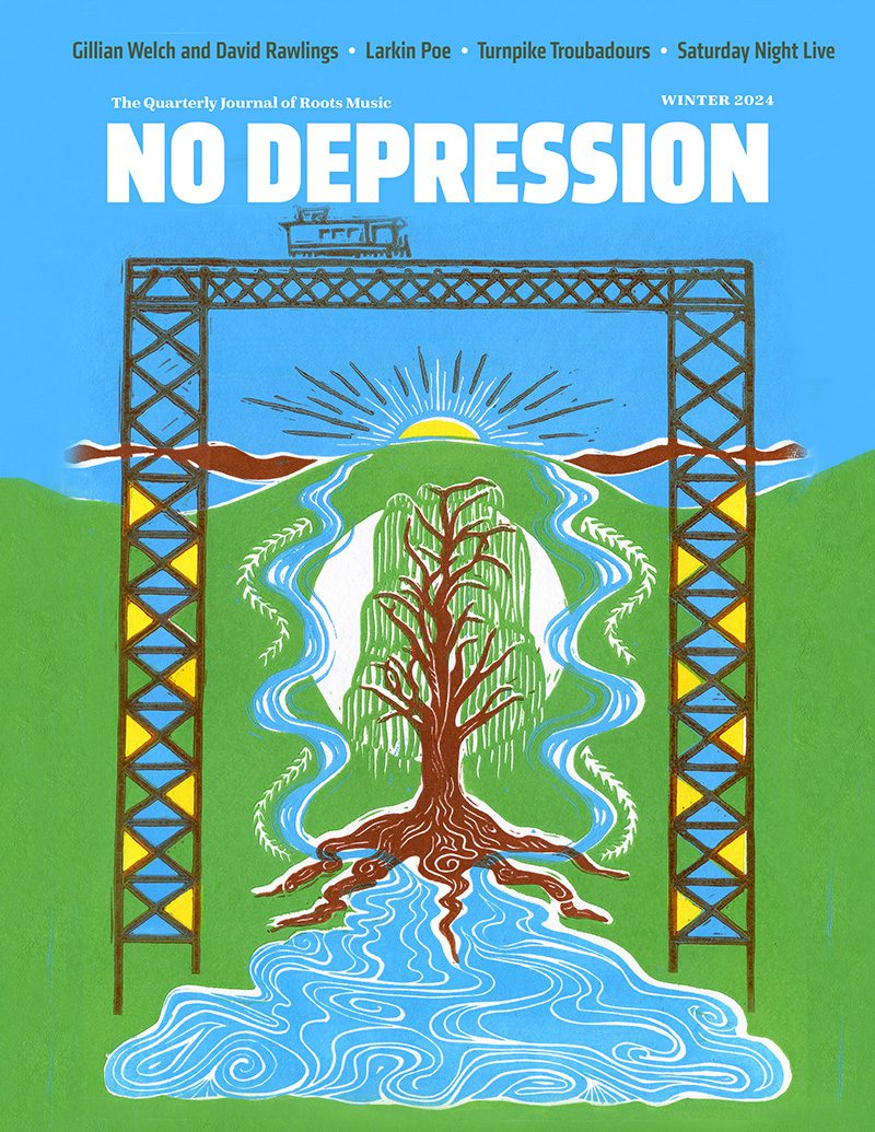
You may also notice, those of you who remember that very roughly created first issue (or you can view the thing online at nodepression.net, if you must), that this current cover is somewhat reminiscent of our first issue. That’s one of the pleasures of the creative process. As I began to play with David Wilds’ cover photograph, dabbling with color and type and some hand-carved letter forms that absolutely refused to cooperate, a few happy accidents led to what you’re holding in your hands. (Even the Townes Van Zandt lyric is an echo from ND #1’s cover.)
Actually, the whole magazine’s a very happy accident and, for me, the realization of a long-treasured dream. Peter and Kyla and I are enormously fortunate to have you as readers, and to have this peculiar enterprise as our principal creative outlet. So once again, thanks. Thanks also to Tom and Mary, who complete our little five-person electrical band, and thanks to our many talented freelance contributors.
Finally, for those expecting a few words in this space about the reaction to Steve Earle’s latest album, surely you have something better to do than watch CNN midday.


