THE LONG HAUL: When Creativity Takes a Detour

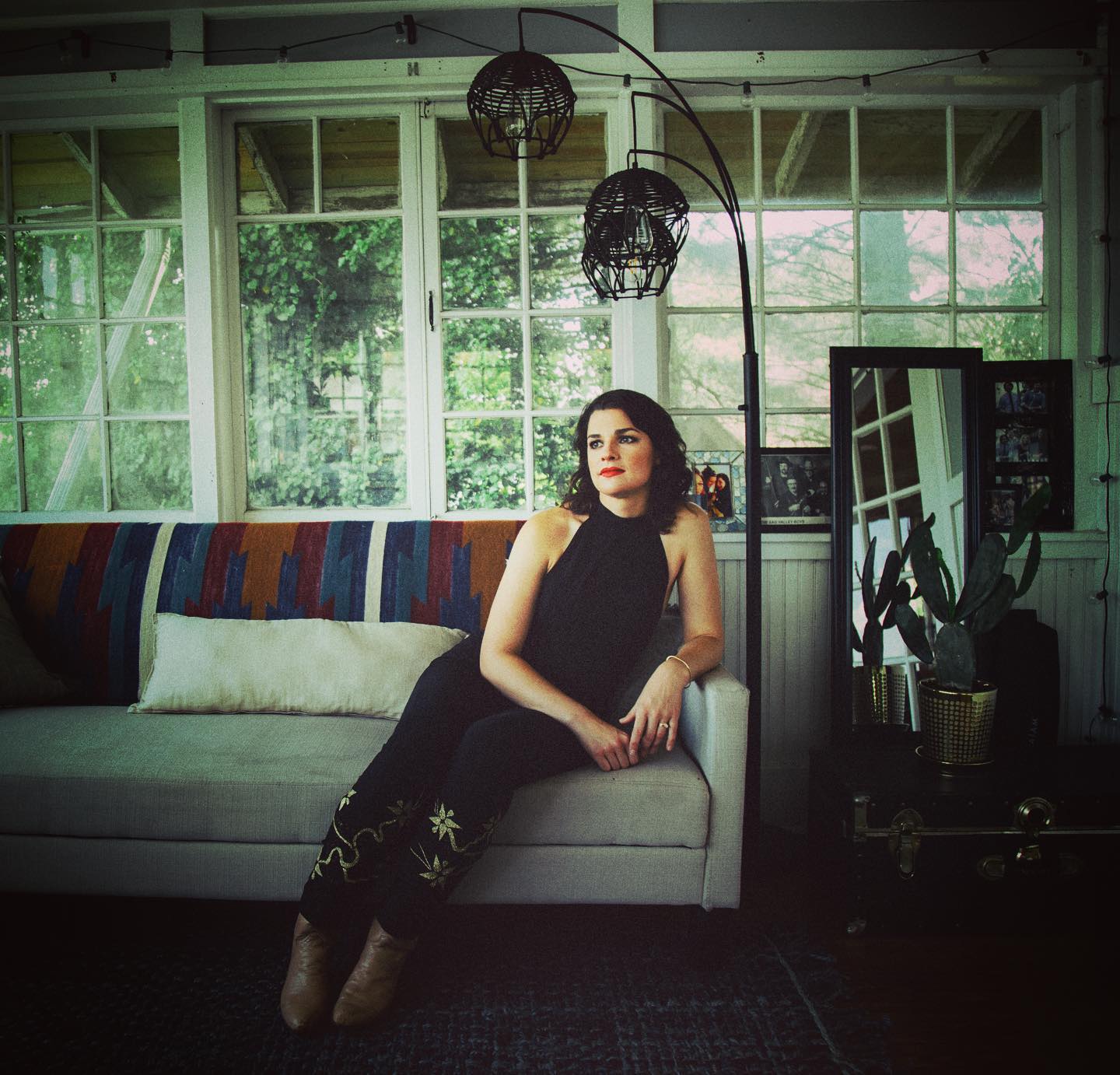
Rachel Baiman in a room she designed in her own home. (Photo by Natia Cinco)
With no hope for a return to touring this year, many musicians have turned to alternative creative mediums while off the road. I have been in awe of paintings by Andrew Combs and Courtney Marie Andrews, poetry and spoken word by Allison Russell, original clothing by Emily Frantz and the many knitting projects of Caroline Spence. My husband, who has always loved cooking, has now become obsessed with creating perfect Italian cuisine.
Seeing the way that different musicians reroute their creativity into other art forms got me thinking about how these mediums must satisfy similar pathways in the brain or desires of the spirit. Personally, my alternative creative outlet is interior design. I love considering colors, textures, and patterns, and the merging of aesthetic beauty with functionality. I love the feeling of transformation in a room, and the way that a great space can set the tone for optimism and productivity. And I’ve realized that I tend to feel the same high when I’ve completed a design project as I do when I’ve finished recording a song in the studio and I listen back to the first mix. So, this month I thought it would be fun to explore the ways in which designing a room might be largely the same as arranging and producing a song.
1. Floor Plan = Arrangement
Let’s consider that an unfurnished, unpainted room is equivalent to the stripped-down song, already fully created. Just as you can’t start designing a room that doesn’t have fully formed walls or flooring, a completed song is the starting point for arrangement and production. So I’m assuming that we are post-renovation here, the song has all verses, choruses, maybe even a bridge, complete and in solid shape. No water damage or foundation issues.
The first thing to look at is functionality, how do you want to use the room? The desired use or uses of a room should determine the floor plan. You want to consider what furniture would be useful, and in what areas of the room it should be positioned in order to facilitate play, sleep, work, etc. A song arrangement is the equivalent to a room’s floor plan. You have your basic elements: sofa, coffee table, lamp, verse, chorus, bridge, and the traditional way that those would be laid out. But you may need to tweak the setup to get the functionality exactly right. Do you have a really short verse form? You may want to sing two verses before moving on to the chorus so that you don’t ruin the tension and give up the hook too quickly. Do you want to use the room as both an office and a guest bedroom? Maybe a futon that folds out would be a good choice.
2. Color Scheme = Instrumentation
Knowing how you want to use a room informs how you want the room to feel, just as knowing what you want to convey with the song arrangement should lead to your choice of instrumentation. Let’s say we’re designing a bedroom. We want it to be a space of calm, and to encourage rest and replenishment. I wouldn’t put a highly energetic and easily exhausting color such as orange on the walls, I’d save that for the home gym. Along those same lines, if I’m working with an intimate love song brimming with nostalgia and reminiscent of a Shakespearean sonnet, I’m not going to be calling in the Cajun triangle. I’m going to be looking for a string section, the musical colors befitting the intended feeling.
3. Contrast Is King
When selecting the specific pieces of furniture in a room, or the specific musical voices that should be featured on a song, I use the same rule of thumb: “contrast is king.” Beauty is best seen in a context of variation. This also means that you don’t need three instruments serving the same role in a song. When selecting furniture, I look for variation in texture and materials: wood, paint, glass, leather, hide, pattern, plain. When arranging a song, I’m looking to fill different sonic and rhythmic spaces without being redundant. Perhaps the rhythm section is missing a strong backbeat, so you add a percussive mandolin chop. Later, the drummer comes in, and you realize that they are filling that role with the snare brushes, and now the backbeat, and that particular texture, is overstated. It’s time to remove or change up one of those elements. Do you have a wooden chair with a wooden coffee table and a wooden bookshelf on wooden floors? WE HEAR YOU, WOOD! It’s time for some glass, metal or fabric in this place!
4. Throw Pillows = BGVs
Once you’ve got the basic elements in place: floor plan, color scheme, furniture choice,
you can consider the final touches. When I think about throw pillows, plants, and artwork, I think about background vocals. Much like adding in those final pops of color and pattern, background vocals can bring a whole track together, creating a perfect focal point that the whole room supports. When I hear a perfect three-part harmony on a bridge or chorus, or a well-placed “ooo” or “aaa” on a poignant verse lyric, I think of a perfectly styled vase, that brings out that lovely but sparsely incorporated third color in the rug pattern. Sometimes you don’t even notice these particular touches as an outsider or listener, but you notice that suddenly the room or song has come into cohesion, and it feels amazing.
Well, that was my fun little journey down the rabbit hole of metaphor and melding creative mediums. I’d be really interested to hear how other artists consider their chosen mediums to be similar or different. Now, somebody get me back on the road so I can stop tearing apart the homes of my various family members!
Here’s a photo gallery of other spaces Rachel has designed:
- Photo by Liliana Baiman
- Photo by Liliana Baiman
- Photo by Rachel Baiman


